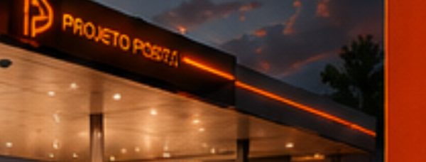
The visual identity of Planalto Gas Station stands out as a benchmark for modernity, credibility, and organization. Its strategic location, with access from both the highway and the city, ensures convenience and appeal for different driver profiles. The station serves customers of all social classes and establishes itself as a reliable, competitive option in the region. To reinforce this perception, the visual identity conveys trust, standardization, and energy. The project enhances the customer experience, strengthens the brand’s market presence, and creates a visual standard that makes immediate recognition easier. As a result, Planalto Gas Station unites contemporary aesthetics, functionality, and impact, consolidating itself as a solid, lasting investment.
The design project promoted a complete revitalization of the structure and raised the station’s aesthetic standard. The canopy features straight lines and a minimalist finish; the pumps received red-and-white cladding as well as metal guards that increase safety. For greater clarity, we planned the price totem as a piece independent from the brand sign, ensuring better visual organization. The convenience store displays an exposed-brick façade, conveying robustness and warmth, while the illuminated sign increases the appeal of the space. Finally, the landscaping with low planters adds harmony and demonstrates aesthetic care, completing the ensemble with balance.
The 3D logo appears exclusively on the canopy fascia and highlights the brand as the central element of the identity, avoiding information overload. With slightly rounded shapes, it conveys dynamism and modernity while recalling the tradition of trust associated with major fuel brands. This choice ensures visual standardization, makes immediate recognition easier, and strengthens consumer recall.
We used red as the main color because it symbolizes energy and movement. In contrast, white conveys cleanliness and organization, creating visual balance. The columns remain white to reinforce uniformity and sobriety.
See more of our gas station design services and explore a related project, Posto Lucas. For industry context on fuel retail, visit NACS.