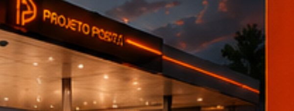
The Mega Posto gas station design project integrates functionality and aesthetics, reflecting the contemporary visual identity proposed by the brand. The new structure optimizes the station’s operations while delivering an enhanced customer experience, creating an accessible, welcoming environment. With a design that prioritizes circulation and convenience, Mega Posto efficiently meets the needs of a diverse audience, promoting a space where service quality combines with a pleasant atmosphere. Elements such as proper lighting, rest areas, and an efficient layout ensure every visit is practical and satisfying, integrating the station into its urban context while respecting and enhancing the region’s aesthetics.
The Mega Posto (MP) design and visual communication project was conceived to create a visually attractive, functional environment. The goal is to deliver a customer experience that engages the senses and builds an emotional connection with the brand.
The chosen color palette, white, yellow, and red, reinforces the station’s visual identity while creating a vibrant, welcoming effect. The colors are applied strategically, highlighting important areas such as the entrance and the convenience store, guiding customers intuitively through the space. Graphic elements such as icons and clear signage complement the design, easing navigation and making the experience more enjoyable.
ACM (Aluminium Composite Material) details on the façades and interior areas ensure durability while providing a modern, sophisticated look. This material highlights Mega Posto’s quality and innovation, attracting customers and conveying trust.
Finally, the visual communication extends to exterior and interior signage, with well-designed, informative signs that promote the available services. This increases the station’s visibility and helps customers quickly find what they need.
See more of our gas station design services and explore a related project, Posto Lara. For industry context on fuel retail, visit NACS.