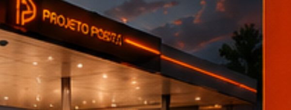
This gas station design project aims to modernize and improve the customer experience while strengthening brand identity. Auto Posto BS began a visual overhaul, and we chose ACM materials in blue, white, and green to convey a fresh, inviting image that reflects quality and commitment to customers. Blue represents trust and professionalism, white conveys cleanliness and modernity, and green evokes a sense of ecology and sustainability.
The canopy fascia became the focal point of the façade, featuring the Auto Posto BS logo in white ACM over a blue background, creating a recognizable, impactful brand that draws attention from the very first moment. We positioned the totem strategically to guide customers to the station intuitively and efficiently; with its modern design and clear information, the green ACM totem delivers a smoother, more organized refueling experience.
We developed the pump spreads and column cladding to complement the overall design, ensuring a cohesive aesthetic throughout the space. We used blue and white ACM to create a harmonious, professional atmosphere, while applying green subtly to add a touch of color and personality.
The Auto Posto BS project not only improved the station’s aesthetics but also contributed to a more pleasant, efficient customer experience. The use of ACM in blue, white, and green, together with the strategic design of elements such as the fascia, totem, and cladding, strengthened the brand identity and consolidated its position in the fuel-station market through complete gas station design and visual identity.
See more of our gas station design services and explore a related project, Milani. For industry context on fuel retail, visit NACS.