We created the visual identity for Ferrari Gas Station to build a strong, memorable brand aligned with the profile of today’s consumer. From the start, we chose to highlight the FERRARI name as the central element of the communication, reinforcing its authority. Because the station sits in a high-visibility area, we saw the need for an identity that combined sophistication, clarity, and visual impact. Every choice of color, shape, and typography followed a strategic logic, designed to attract attention and convey professionalism. We also sought to balance aesthetics and functionality, pairing a modern look with practical solutions, always considering the driver’s experience, from identification to reading the services. As a result, we delivered a project that enhances the environment, reinforces the perception of quality, and consolidates the brand in the market.
To highlight the brand efficiently, we structured the project around three fundamental pillars: visibility, visual coherence, and impact. We chose red to convey personality, energy, and boldness, qualities that, not by chance, point directly to the Ferrari universe. White, on the other hand, acts as a balancing element, reinforcing the sense of cleanliness, clarity, and trust.
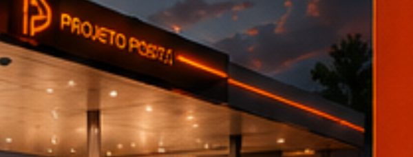
The FERRARI name appears prominently across all main structures: the canopy fascia, the store façade, and especially the totem. To ensure maximum visibility, we worked with uppercase typography, clean lines, and well-defined proportions that guarantee legibility even from a distance. We also applied materials such as ACM and LED lighting, which raise the project’s visual standard and provide high aesthetic performance, both day and night.
Throughout the entire process, we made a point of keeping the station’s visual identity consistent at every customer touchpoint. From arrival on the forecourt to the internal signage, every detail was designed to reinforce the brand image. This let us create a unified visual language that conveys professionalism. In short, it was a complete solution capable of strengthening Ferrari’s positioning in the gas-station segment through complete gas station design and visual identity.
See more of our gas station design services and explore a related project, Esquina 1. For industry context on fuel retail, visit NACS.