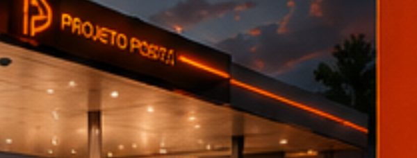
The new image of GP Gas Station was born with the purpose of consolidating a strong, modern, and attractive identity. The project seeks to impress customers and investors by uniting functionality and sophistication in a concept that strengthens the station’s presence in the region. Clear visual communication and standardized elements convey trust, organization, and aesthetic impact at every customer touchpoint.
We planned the new image of GP to enhance every detail of the structure while offering a distinctive experience. The canopy combines blue and yellow, vibrant colors that create visual contrast and convey modernity. The LED lighting outline reinforces the architectural appeal and increases nighttime visibility. The price totem, vertical and robust, stands over seven meters tall and integrates an electronic LED panel that makes updating prices easier.
We clad the columns in blue, with yellow and white details. To complement this, the suspended signage indicates each fuel type, Gasoline, Ethanol, and Diesel, ensuring organization and practicality for drivers. The convenience store received a clean façade made of glass with an ACM sign in blue and yellow. This solution conveys sophistication, invites customers in, and transforms the consumption experience.
The automotive services area features an oil-change bay identified by standardized visual communication and equipped for fast, efficient service. With this, we expanded revenue possibilities and added value to the station.
Finally, we planned the landscaping and ambiance as humanizing elements. Decorative planters and a small outdoor lounge area offer warmth and well-being, reinforcing the sense of care and enhancing the customer experience.
See more of our gas station design services and explore a related project, Grupo Soares. For industry context on fuel retail, visit NACS.