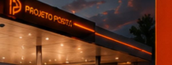
We developed the visual design project for Grupo Soares Gas Station to consolidate the brand as a benchmark in the fuel market while creating a visual language accessible to all audiences. We carefully planned every visual element to reinforce the station’s presence on the city’s main avenues. We prioritized clear reading of the brand from a distance, which makes access easier for drivers during peak hours and ensures continuous visibility at night.
We developed the Grupo Soares logo with curved lines and an abstract design to generate immediate recognition and convey solidity, trust, and closeness to the consumer. In this gas station design project, we highlighted the group’s name as the main element of the canopy fascia, applying red and white with a high-gloss finish, which increases contrast and attracts attention even in busy urban settings.
We chose a modern, strong visual language. In this way, we clearly represented the group’s goal of growing in a standardized, strategic manner, connecting its different units under a single visual identity.
We structured the design kit to convey professionalism, organization, and visual standardization at every customer touchpoint. To achieve this, we included functional uniforms for attendants and managers, business cards, email signatures, letterhead, notepads, badges, stickers, envelopes, and A4 folders.
We produced all materials strictly following the Grupo Soares visual identity. With this care, we left the files editable, allowing adjustments according to the supplier’s needs and ensuring more flexibility and agility in execution.
See more of our gas station design services and explore a related project, Posto Ferrari. For industry context on fuel retail, visit NACS.