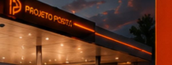
The visual identity project for Líder Gas Station, located in General Carneiro/PR, was developed to turn the unit into a highway landmark and strengthen immediate brand recognition. From the start, the proposal connected the Líder Auto Posto identity to a contemporary, high-impact visual language designed for quick reading while in motion. The project translates values such as reliability, efficiency, and organization through clear visual solutions, strong contrasts, and direct communication. The visual identity guides the customer easily, improves the user experience, and creates a safe journey from the entrance to the exit of the refueling area. At the same time, the concept prioritizes visibility, operational safety, and nighttime performance, balancing aesthetics and functionality.
The visual identity project organizes the station strategically for the highway context, prioritizing legibility, flow, and well-defined volumes, with emphasis on the horizontal canopy, which functions as the main communication element and shelter for the refueling areas.
The color palette is marked by institutional orange, combined with white, gray, and black, ensuring high contrast and easy reading from a distance. These elements, applied consistently across the canopy, pumps, signage, and communication panels, reinforce the venture’s visual unity.
In parallel, the convenience store integrates into the main flow, with a transparent façade and a highlighted frame, which expands visibility and the relationship with the outdoor space. Finally, the recessed lighting under the canopy and in the identity elements ensures efficient visual performance at all times of day, especially at night, enhancing the architecture and reinforcing the station’s safety and presence in the highway landscape.
The station’s visual identity was conceived to express a strong, highly recognizable presence. The canopy receives vibrant orange ACM cladding, continuous communication, and integrated lighting, ensuring prominence both day and night. The white graphics and the contrast with neutral tones reinforce brand recognition and make the services easy to read.
See more of our gas station design services and explore a related project, Taquaruçu. For industry context on fuel retail, visit NACS.